Qlik is a complete data discovery and analytics platform. With its modern interface, Users can model and manage data, Create Visualizations, Layouts, and stories.
Qlik has one of a kind associative engine that helps users to explore data in all directions. This makes Qlik stand out from the others.
Here are some of Qlik’s best practices.
Scripting
- Add a description of the transformations to understand why it has been scripted in such a manner.
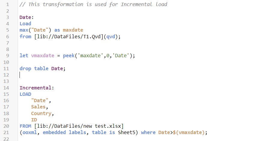
- The script should be split into sections based on table or qvd and each section should contain only a single table’s transformations to understand the script easily.
- Use the main section for app configuration variables and other global variables.
- The search index (CreateSearchIndex) should be set to Zero to reduce the reload time in the ETL apps.
- Restrict the data and only load the data that is to be used for analysis.
- Try to do the possible calculations in the script rather than in the front end for better functionality of the app.
Data Modeling
- A normalized star schema is the desired data model for Qlik as it is the most efficient and understandable. In some cases, a snowflake schema is necessary and helps to manage the widths of the tables but may be inefficient as an association has to travel through intermediary tables.
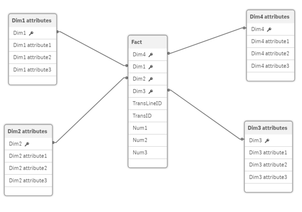
- All the tables in the data model should have an association and data islands should be avoided unless those are used to add further functionality.
- Synthetic keys should be resolved. While synthetic keys can be valid, Qlik may not handle them efficiently when the data volume is high.
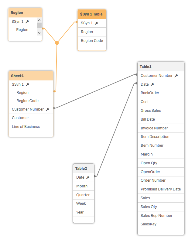
- Circular references should not exist in the data model. It causes uncertainty in the data structure.
- Hide fields that are not used for analysis.
- Tables should be named. This will allow users to filter the fields list by table names easily.
Visualization
- Identify user priorities and understand how they view data to determine how to present the data.
- Make sure the dashboard refreshes quick. The user experience will be bad if your dashboard takes a long time to display the data. It may be due to several factors like a lot of data, bad data modeling, and bad practices.
- Choose the ideal location of the KPIs. Always place the important indicators on the top.
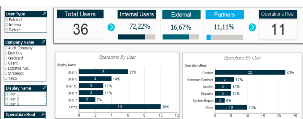
- Identify the elements that make up logical groups and bring them together in a single sheet.
- Limit the number of charts and colors in a single sheet. If the dashboard has a number of charts and colors, it will be difficult for the user to interpret the data. Try to show only the main required data so that it will be easy for the user to understand.
- It is important to validate the sheets of your application with users throughout the development cycle. This will save time by avoiding possibly reviewing all the elements of the dashboard at the end of the project.
N-Printing
- Qlik N-Printing is an add-on to Qlik Sense that is used to create and distribute static reports in MS office and Pixel Perfect formats.
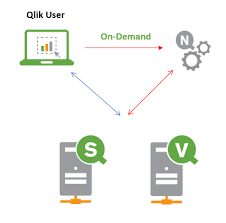
- Through N-Printing we can schedule and deliver the reports to the user’s mail.
- Once the connection is established in N-Printing, it automatically fetches the latest reports from the Qlik Sense.
Reusing the Visuals
- With the help of master items, we can reuse the visualizations n number of times in the dashboard.
- Even the users can be able to reuse the master visualizations after publishing the dashboard.
- We can create themes and can use them in other applications.
Automation
- We can integrate Qlik Sense with third-party tools to automate the deployment pipeline.
- With automation, we can publish and roll back to previous versions of the dashboard.
Story Telling
- Qlik has an exclusive feature called storytelling. With the help of this, we can create stories of the reports and commentary on the data analytics visuals being displayed.
Author: Uday Kumar Bandaru
Advanced Analytics